Why Every Designer Secretly Hates Comic Sans (But Won’t Admit It)
The font that refuses to die, no matter how much we mock it

“If you love it, you don’t know much about typography. If you hate it, you don’t know much about typography either.” — Vincent Connare, creator of Comic Sans
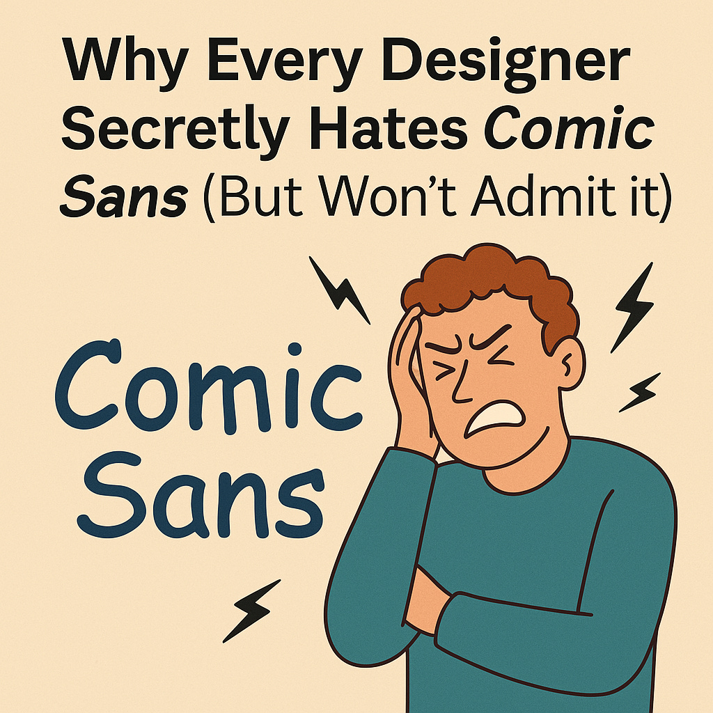
The Most Hated Font in Design History
Comic Sans. The font that haunts designers. The one that refuses to disappear no matter how much we mock it. It’s survived decades of ridicule, yet somehow, it still finds its way into posters, presentations, and even official documents.
Why do designers hate it so much? And why do people keep using it? Let’s break it down.
How Comic Sans Was Born (And Why It’s Not Its Fault)
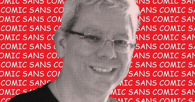
In 1994, Microsoft designer Vincent Connare created Comic Sans for a Microsoft Bob program. The idea was simple: a playful font resembling comic book lettering, perfect for a friendly, informal vibe.
The problem? Microsoft Bob flopped, but Comic Sans escaped into the world — and people started using it for everything.
Why Designers Hate It (With a Passion)
1. It Shows Up in the Worst Places
Comic Sans was meant for casual, fun settings. Yet, it somehow ended up on legal documents, business reports, and even warning signs. Imagine seeing “Serious Hazard: Do Not Enter” written in Comic Sans. Would you take it seriously? Probably not.
2. It Breaks Every Rule of Good Design
Typography is about balance, spacing, and readability. Comic Sans ignores all of that. Its letters are unevenly spaced, poorly shaped, and lack structure. It’s like the font equivalent of using Papyrus for a sci-fi movie (looking at you, Avatar).
3. It Looks Unprofessional (And Everyone Knows It)
Ever seen a PowerPoint presentation filled with Comic Sans? It instantly screams “I didn’t try very hard”. Even worse, imagine receiving a job rejection email in Comic Sans. Ouch.
The Guilty Secret: Have We All Used It?
Here’s the truth: even designers have accidentally used Comic Sans at some point. Maybe it was for a childhood project. Maybe it was a moment of desperation. We don’t talk about it, but deep down, we all know the shame.
But Wait… Is Comic Sans Useful?
Despite all the hate, Comic Sans has one unexpected advantage: it’s easy for people with dyslexia to read. The irregular shapes make it more distinguishable, helping those with reading difficulties. So, maybe — just maybe — it has a purpose after all.
Final Verdict: Should We Forgive Comic Sans?
Will Comic Sans ever be fully accepted in the design world? Probably not. But should we still roast it whenever we see it misused? Absolutely.
One thing’s for sure: as long as bad PowerPoints and questionable flyer designs exist, Comic Sans will never truly die.