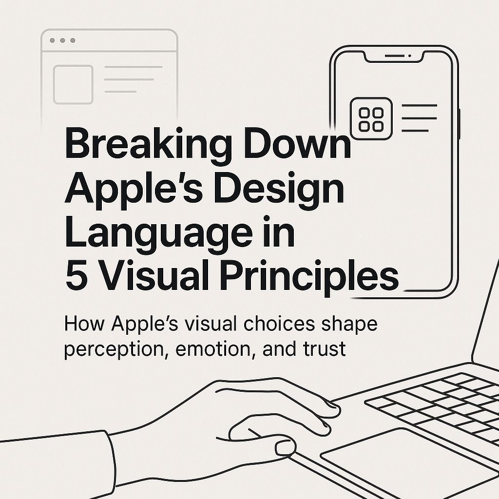
Breaking Down Apple’s Design Language in 5 Visual Principles
How Apple’s visual choices shape perception, emotion, and trust

Apple has never been just a tech company. Its power lies not only in innovation but in how that innovation is visually and emotionally delivered. From iOS interfaces to packaging, Apple’s design language is precise, human-centered, and deeply intentional.
In a world flooded with design trends and visual clutter, Apple continues to stand out—without shouting. Let’s explore five core visual principles that define their design ethos and what designers at all levels can learn from them.
1. Clarity Above All
Apple’s design communicates without confusion. Every element exists to inform, not distract. Whether it’s a product page or an app screen, you’ll notice a strong use of whitespace, limited color palettes, and an emphasis on essential content.
Typography is clean, icons are universal, and layouts are structured to guide the eye. Clarity isn’t treated as minimalism for aesthetics’ sake—it’s a deliberate choice to enhance usability.
Design insight: A clear interface makes users feel confident. When in doubt, reduce to clarity, not just to simplicity.
2. Consistency Builds Trust
Consistency is the invisible framework that holds Apple’s ecosystem together. From the typeface (San Francisco) to button styles and gestures, every detail aligns across products and platforms.
This cohesive visual rhythm creates familiarity. Users intuitively know what to expect—even on a new device or after a major update.
Design insight: Consistency reduces the cognitive load. Repetition, when purposeful, becomes part of your identity.
3. Depth Through Restraint
Apple’s approach to visual depth is subtle. Shadows are used sparingly to differentiate layers, gradients add dimension without distraction, and blurs signal transitions between foreground and background.
Nothing is ornamental. Visual treatments are used with restraint, always in service of hierarchy and focus.
Design insight: Use depth not for decoration, but for direction. Ask what the visual treatment is helping the user understand.
4. Guided Flow
Every Apple interface is crafted to move the user through a clear and intentional path. From top-down content hierarchy to edge-to-edge swipes, the experience feels choreographed but not rigid.
Each interaction—whether a tap, scroll, or haptic response—reinforces momentum. The user rarely feels lost.
Design insight: Design for progression. Make it feel natural for the user to keep moving forward.
5. Emotion Through Elegance
Apple doesn’t design for function alone—it designs for feeling. Micro-interactions, animation timing, sound design, and even loading states are tuned to feel human, refined, and intentional.
This is why people describe Apple’s products as “satisfying” or “delightful.” The experience is quiet but emotionally resonant.
Design insight: Good design solves problems. Great design also stirs emotion. Aim for both.
Final Thought
Apple’s design language teaches a timeless lesson: when visual decisions are guided by clarity, consistency, restraint, and empathy, the result is not just beauty—it’s trust.
As designers, the goal isn’t to imitate Apple but to understand why their design works so well—and how we can apply those principles to our own practice with the same level of thoughtfulness.
If you found this helpful, consider subscribing to the newsletter. I share thoughtful design breakdowns, creative workflows, and behind-the-scenes reflections every week.